Project one
Teckro
(2023, 4 months)
Contacts Redesign
Overview
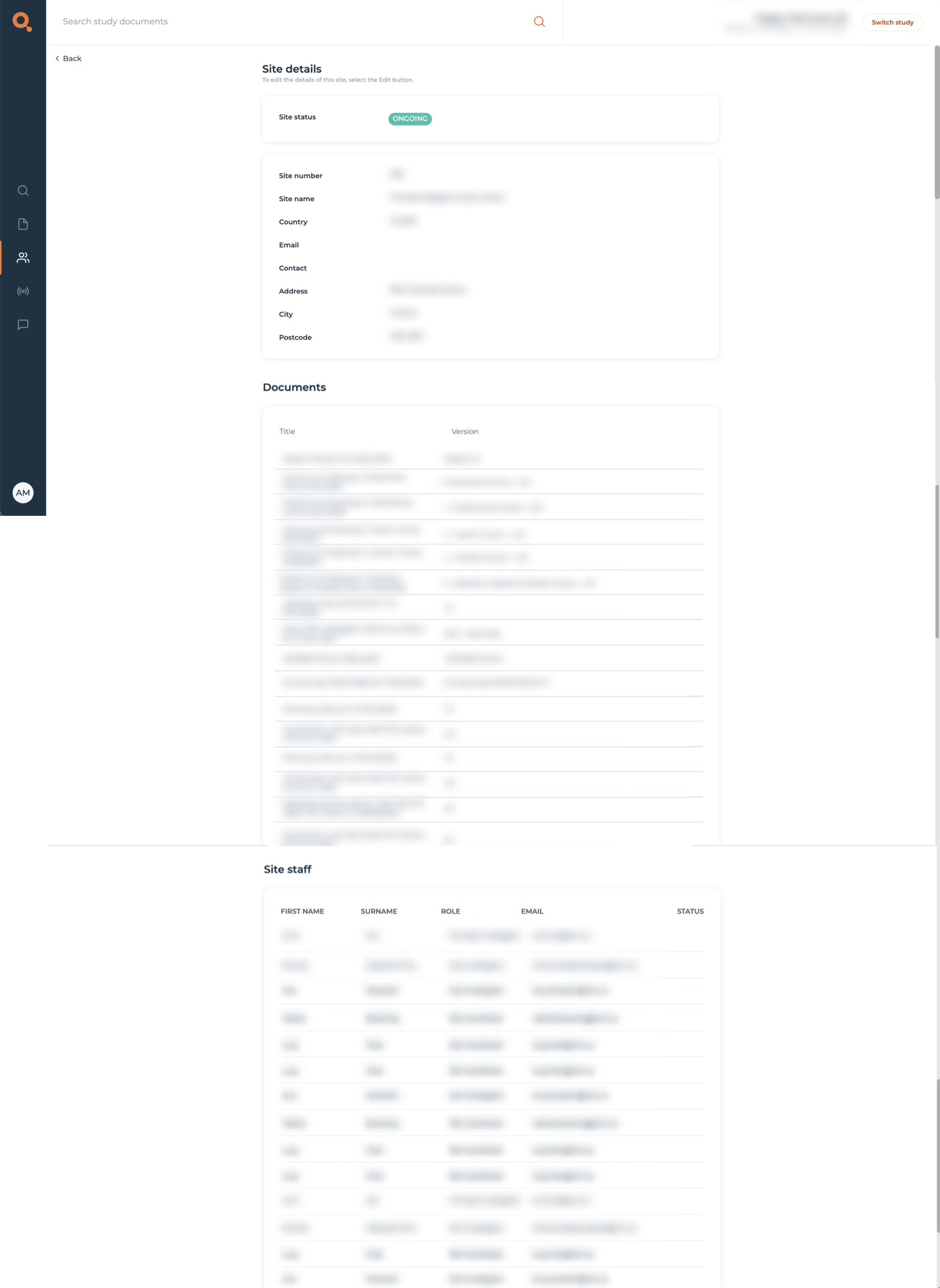
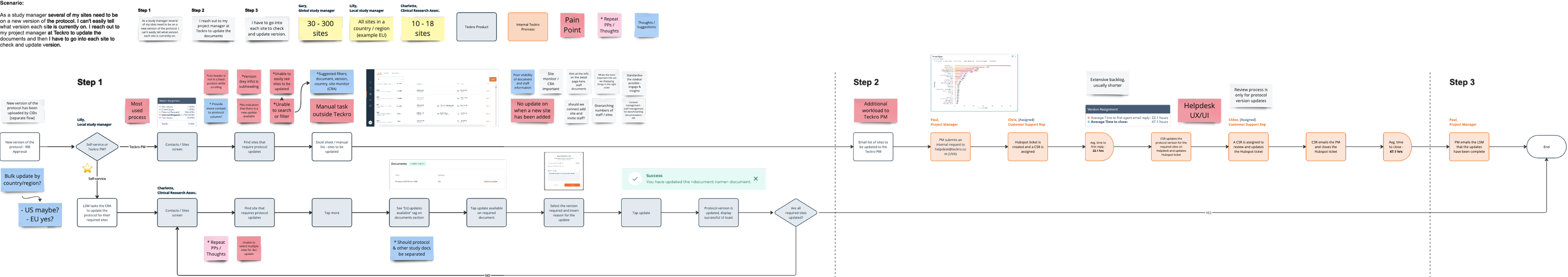
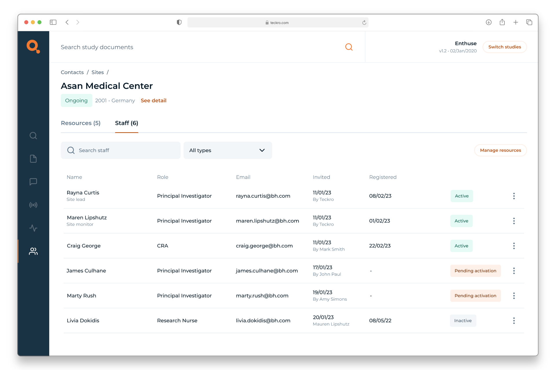
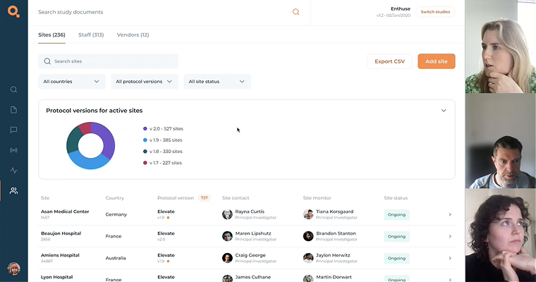
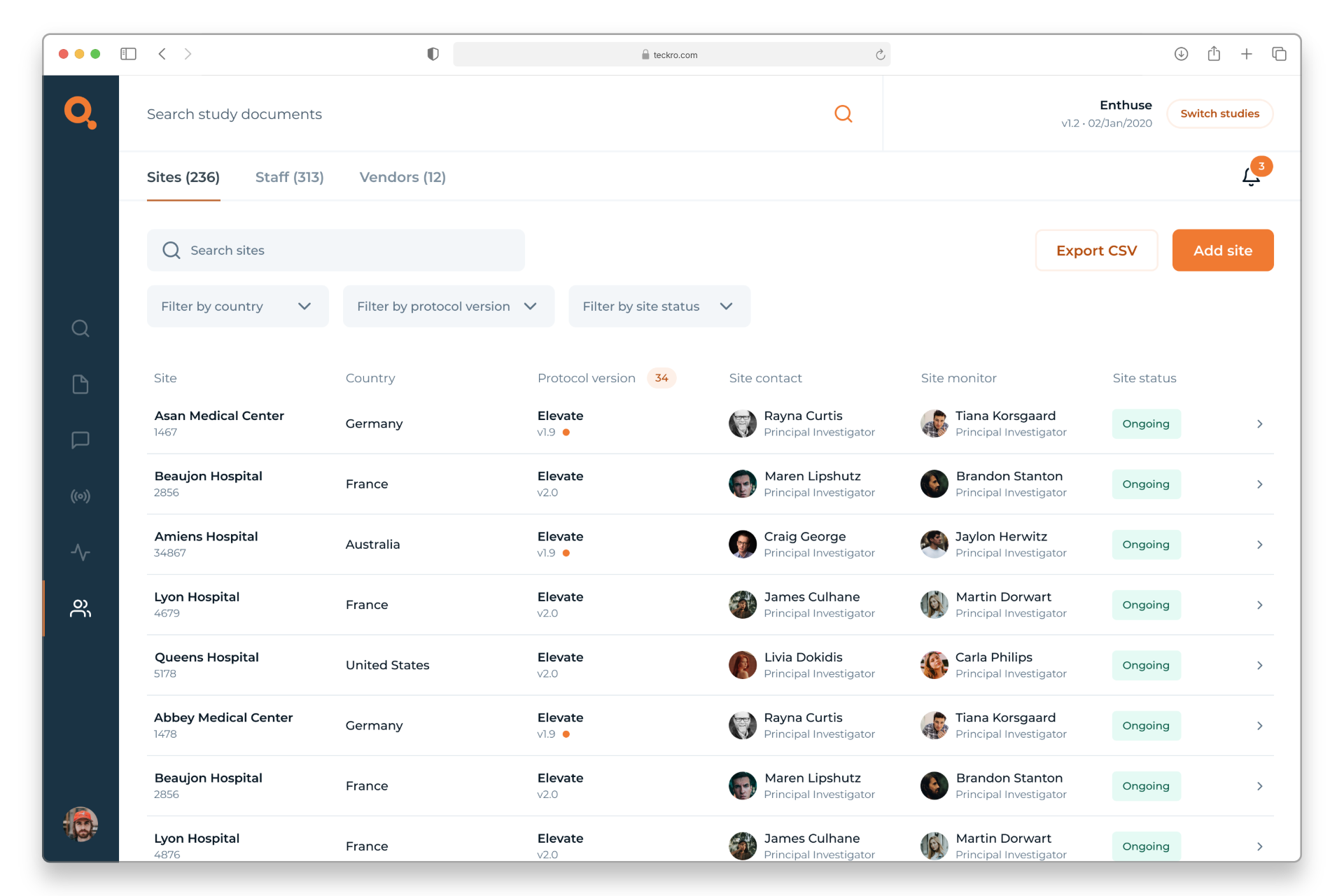
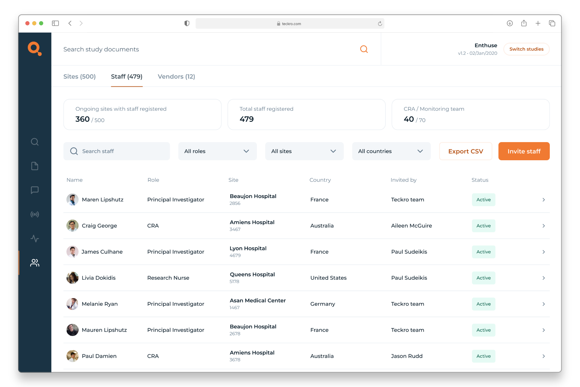
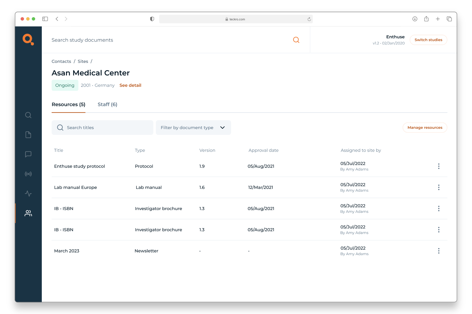
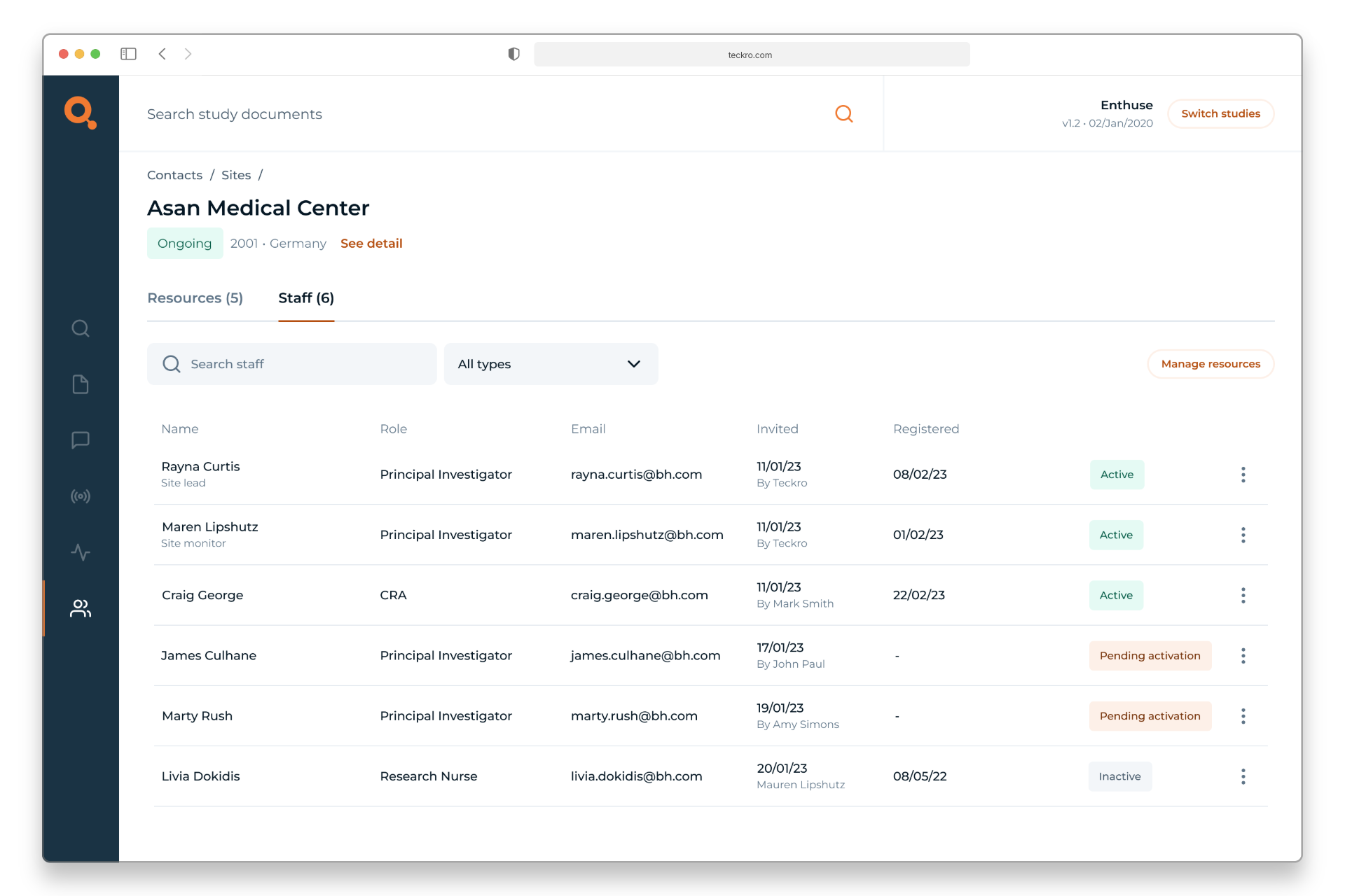
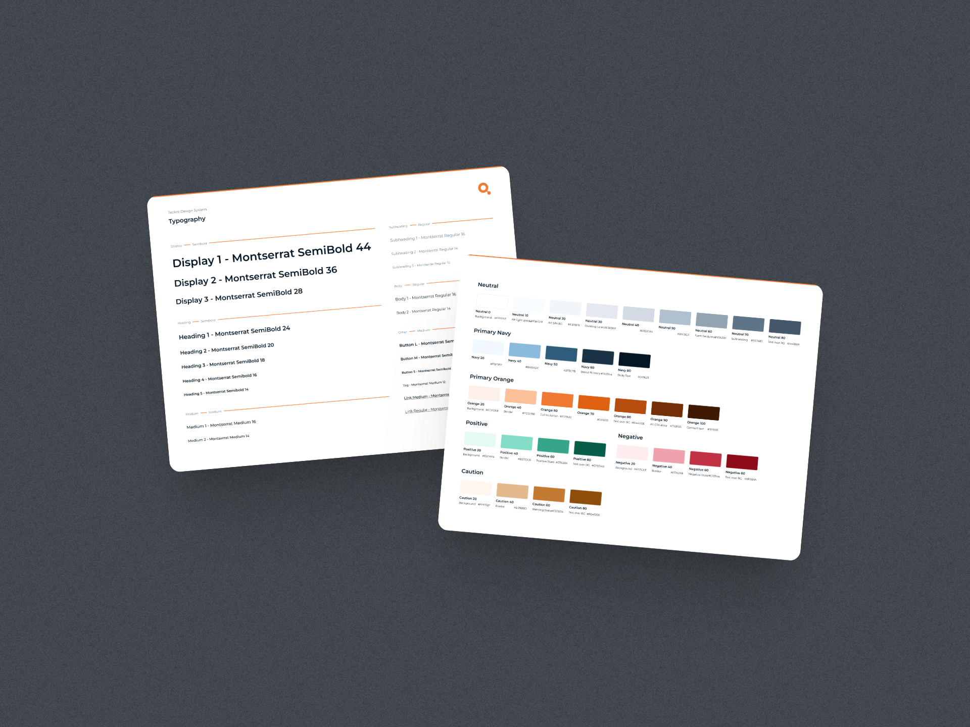
At Teckro, I worked on redesigning the Contacts section of our platform — a tool used in clinical trials to manage information about sites, staff, and associated vendors. The existing design was dated and struggled to surface meaningful, actionable data. For example, it wasn’t clear when a site was using an outdated protocol version or when key staff hadn’t yet been registered.

As a result, users often missed important information or found it hard to locate. The challenge was to reimagine this experience so that the interface could better support the complexity of trial data, and help users easily access what mattered most.
Responsibilities
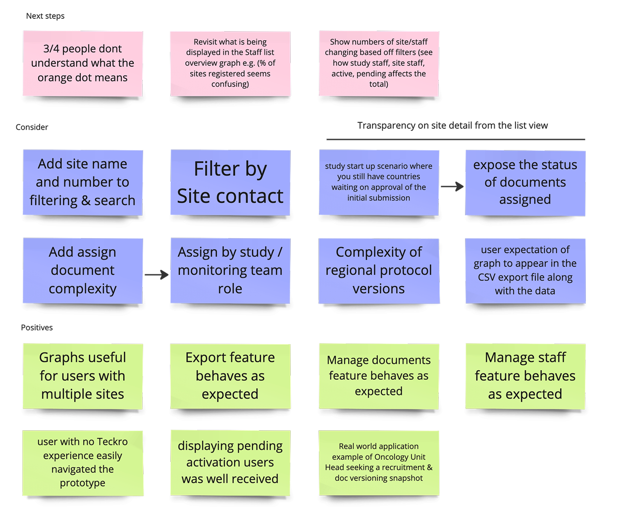
  • Running research sessions and user testing to better understand pain points
  • Supporting and facilitating workshops with stakeholders
  • Leading UI design and ideation, from early concepts through to final designs
Requirements
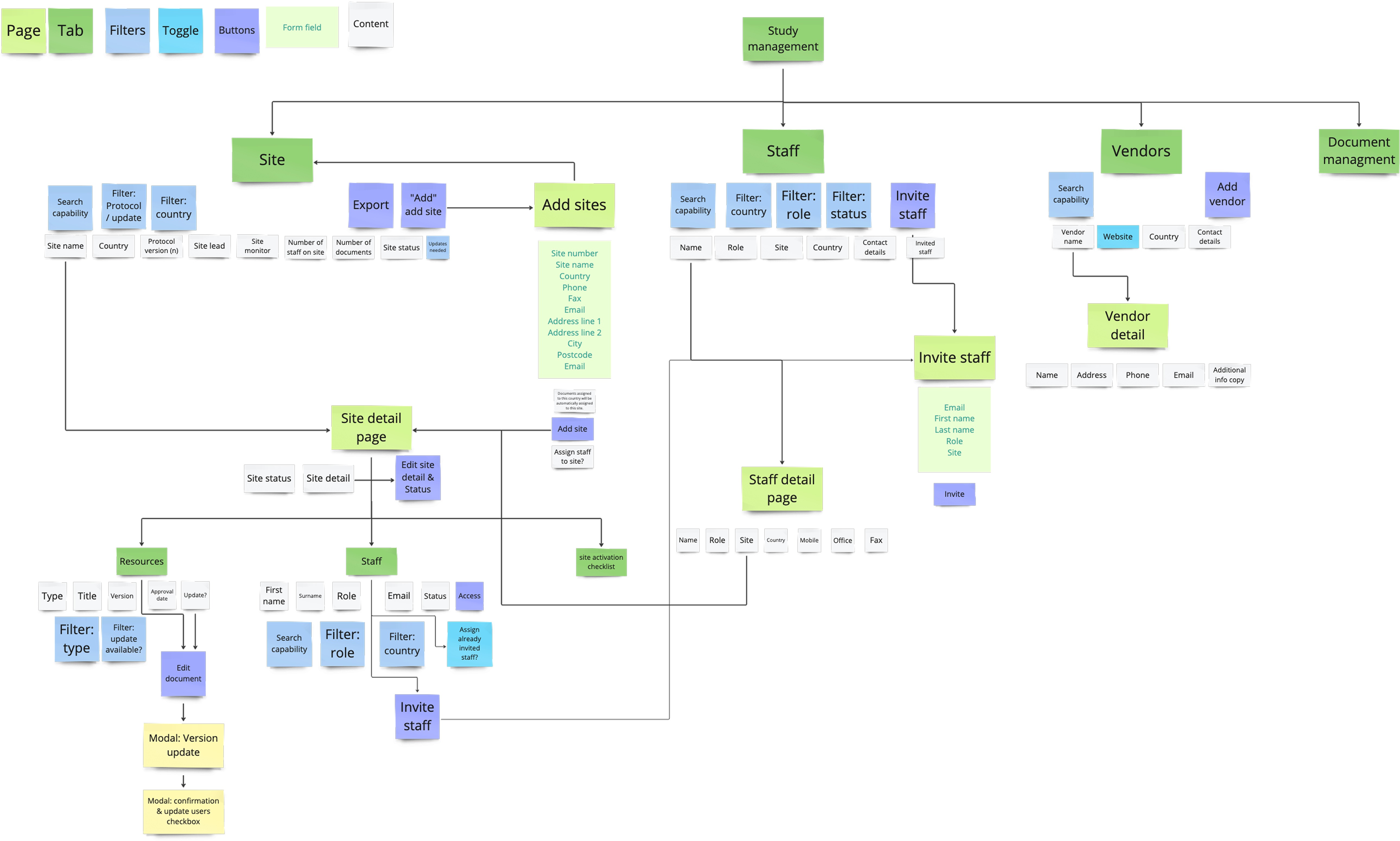
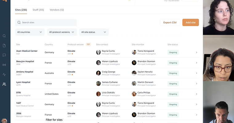
  • Auditing the existing Contacts section and gathering internal and external feedback
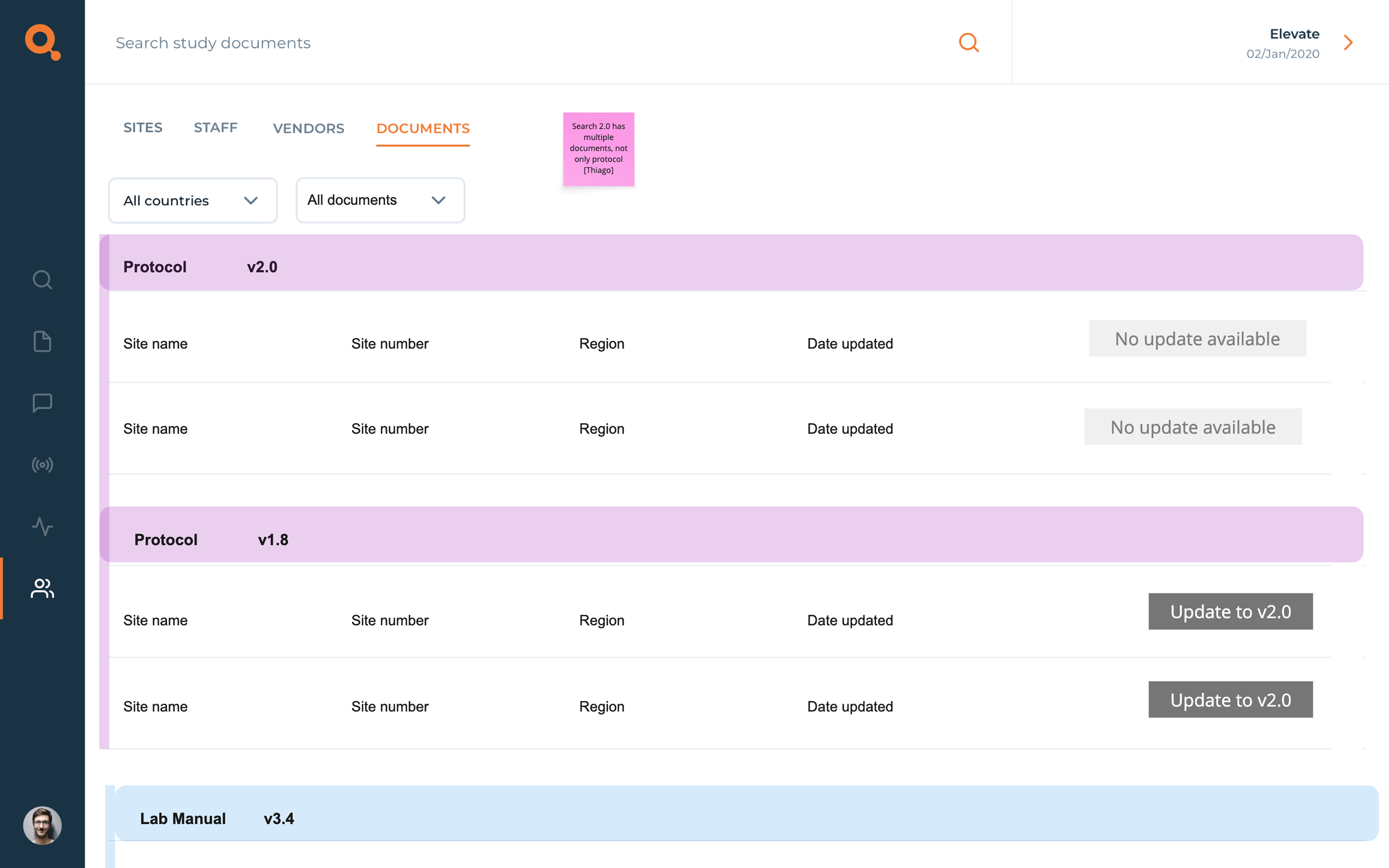
  • Redesigning the interface to make key information clearer and easier to access
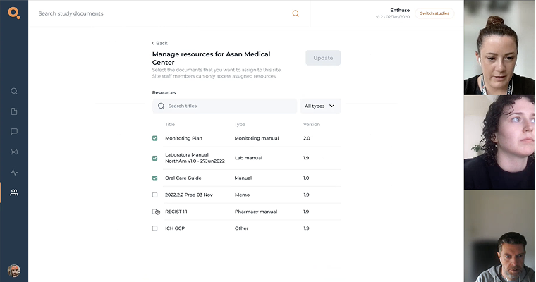
  • Creating an intuitive, self-serve system for document management
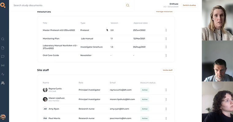
  • Reworking the Site Detail page to accommodate more complex data structures without overwhelming the user
Project steps
1
Research & discovery
2
Define
& ideate
3
Design
4
Prototype
& test
5
Project 
conclusion
Key issues

Limited visibility of important updates

Important data points like unregistered staff or outdated protocol versions were buried in the UI, making it easy for users to miss.

Confusing and inconsistent layouts

Tables, filters and layouts changed from page to page, making information difficult to find.

Outdated and inflexible layout

The interface hadn’t evolved to meet user needs, resulting in a rigid design that couldn’t scale with the growing complexity of clinical trial data.

Research and discovery
1
I began by diving into the existing Contacts section, which included site, staff, and vendor data. The interface felt cluttered and some features were buried or unclear, so I performed a thorough audit. I mapped out the current information architecture, noted the navigation flow, and observed how users interacted with the page. Alongside this, I talked with team members and conducted user interviews to gather feedback. Staff and stakeholders expressed that finding specific contacts was frustrating and certain features were not easily visible.
  • Hidden features: Search and filtering options were either hard to find or inconsistent between sections, meaning users missed important functionality.
  • Inconsistent labelling: Some fields were duplicated across sections or had unclear labels, which made the data entry seem disorganised.
  • Overloaded interface: Too much data was displayed at once without clear hierarchy, so critical actions were not obvious and information wasn't easily accessible.
These insights made it clear we needed a more intuitive structure and a design that highlighted key features. Combining my heuristic review with real user feedback painted a clear picture: users were frustrated by an interface that hid functionality and made them guess where information lived. This research set the stage for a redesign driven by actual user needs.
Example of live data too complex for the original structure
Audit of current app experience
Define & Ideate
2
Next, I rethought the structure of the Contacts section. I started by sketching a new information architecture that logically grouped related contacts and data. To validate this approach, I ran workshops with product managers and internal colleagues with previous clinical trial experience. Together, we prioritised which features and data needed prominence.
  • Central search: A prominent search bar so users could quickly find any contact/site by name.
  • Effective filters: Clear filtering options (by country, protocol version, sites, roles etc.) so users could navigate long lists easily.
  • Visible actions: Action buttons clearly visable (like “Add”, “Invite”, or “Update protocol”).
  • Distinct sections: Well-labelled sections or tabs for Site, Staff, and Vendor contacts, each with a consistent layout.
I turned these ideas into low-fidelity wireframes. I presented these wireframes to stakeholders and did a quick sanity check with internal team members with previous site experience. Their feedback helped refine the plans. This collaboration ensured the wireframes reflected both user needs and business goals.
Information Architecture
Wireframe
Design
3
Then I moved into crafting the high-fidelity UI. My goal was to surface actionable data clearly while managing complexity. Data is laid out with clear hierarchy. Key design decisions included:
  • Comprehensive, consistent information structure
  • Data emphasis
  • Actionable elements
  • Managing edge cases
By the end of the design phase, the new interface felt organised and user-centred. Every element had a purpose, and nothing competed for attention unnecessarily. I was excited to move to prototyping, confident that these updates were going to make a big difference for our users.
High fiedlity
Prototype and test
4
After finalising the designs, I built an interactive prototype to validate the experience. Using Figma, I linked together the main flows, including searching, filtering, and editing contacts. Then I conducted usability testing with real users. The feedback was encouraging: testers praised the cleaner layout and said it felt “very intuitive.” Based off feedback, I iterated quickly on the prototype. A second quick round of testing confirmed those changes worked well – users completed all tasks successfully and expressed satisfaction with the design.

See prototype here.
User testing with prototype
Insights from testing
Project conclusion
5
Overall, the project not only improved the user experience but also strengthened trust in our product. It demonstrated that thoughtful UX work can have a real, practical impact.
Key learnings
  • Presenting only the most essential information upfront made the interface much easier to use. Hiding less-critical fields behind expandable sections helped users focus on their immediate goals.
  • Making important features obvious (a prominent search bar, clearly labelled filters, visible buttons) significantly reduced confusion. Small UX touches like these had a big impact on usability.
  • Watching users interact with the prototype helped me catch and fix issues early. Being ready to adapt  resulted in a stronger final design.
Staff & Site overview
Site detail page
Prototype
Impact of the redesign

Better decision-making through surfaced insights

Users could now easily spot what needed attention, helping them act faster and stay compliant with trial protocols.

Improved user confidence and efficiency

Clearer structure and layout made it easier to navigate complex information, reducing time spent searching and second-guessing.

Positive feedback from both users and stakeholders

Initial testing and internal reviews highlighted that the redesign felt more modern, intuitive, and aligned with user workflows.

UI UX projects
Design projects