Teckro
(2020, Ongoing)
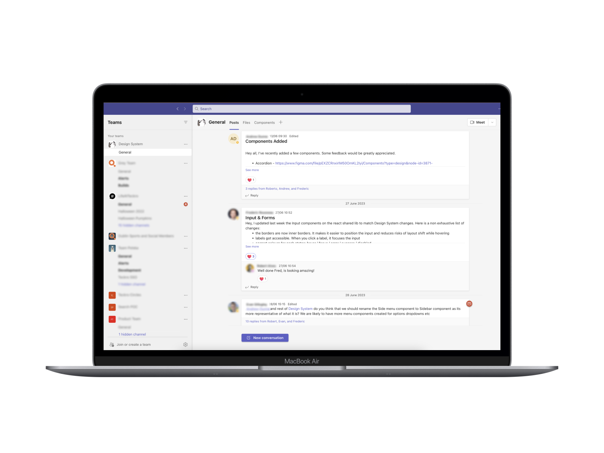
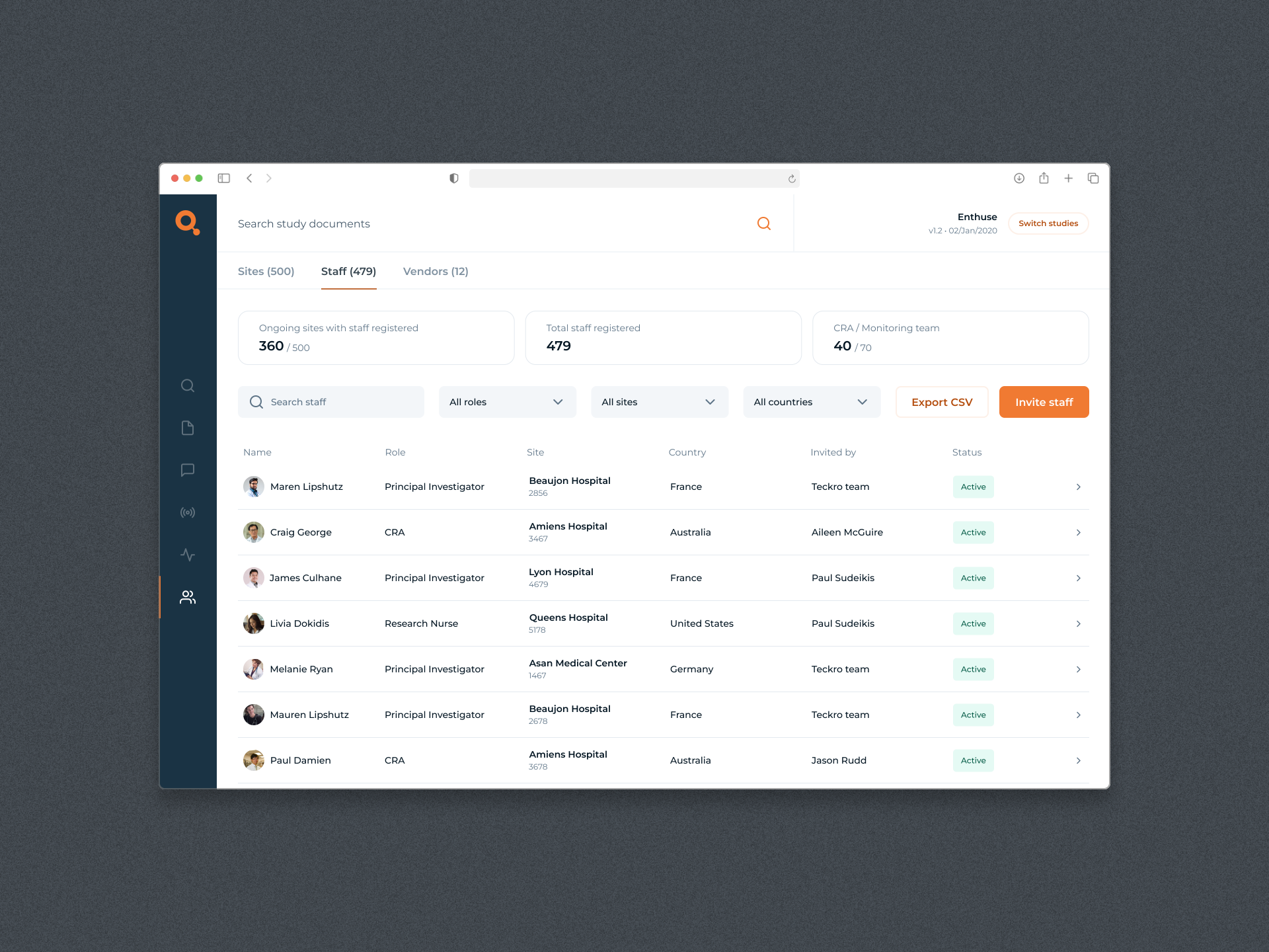
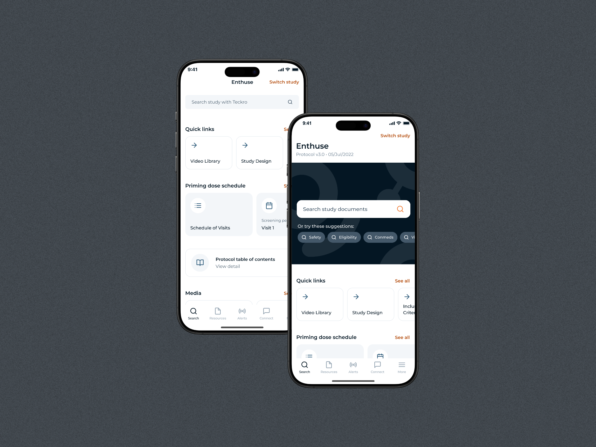
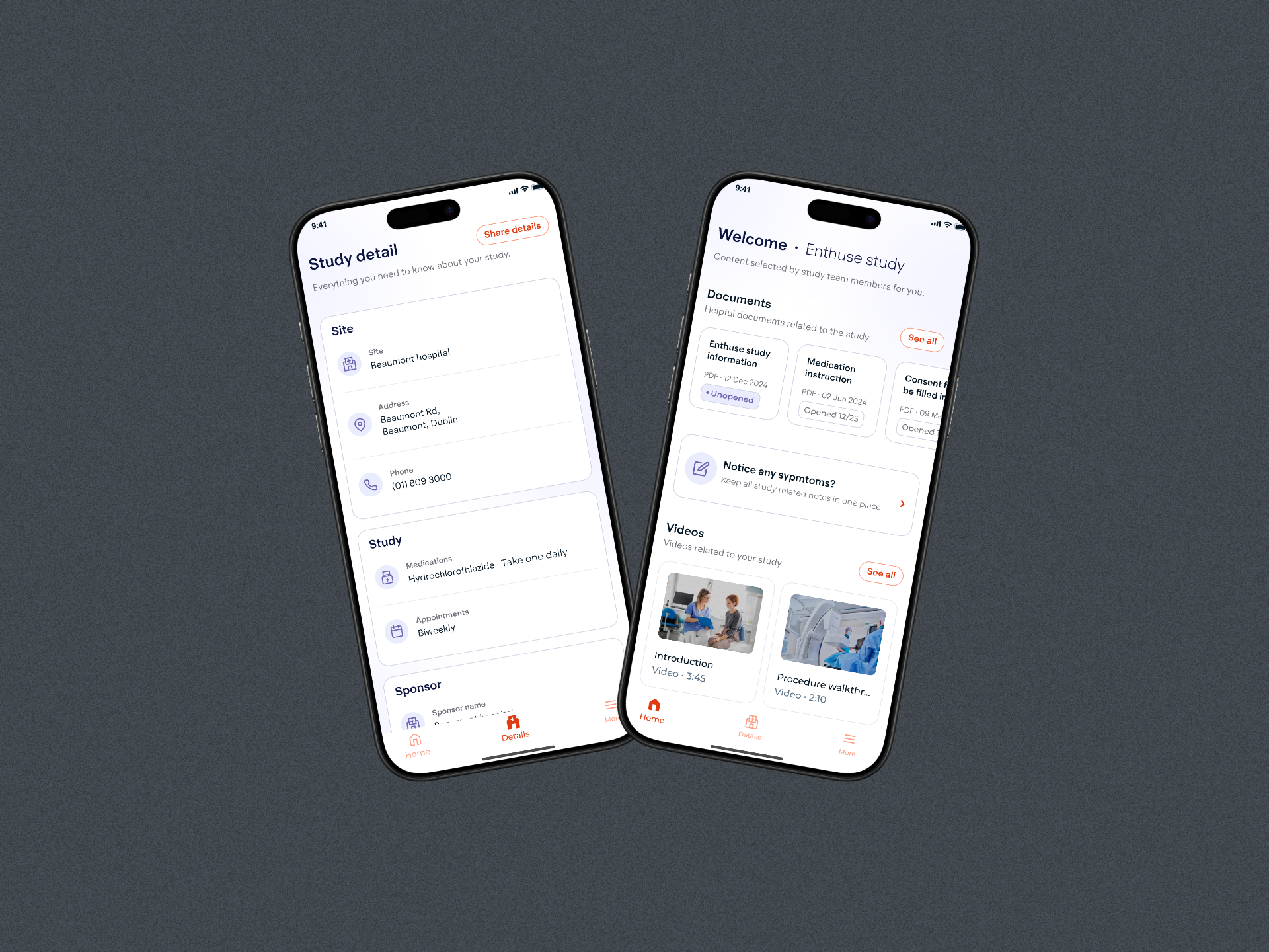
Design System
Overview
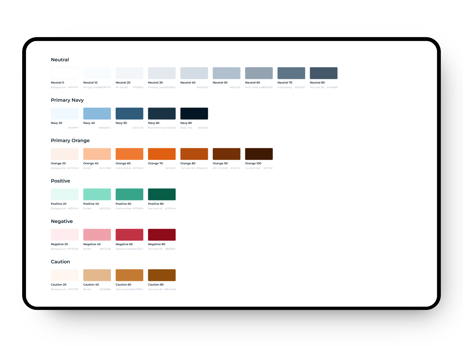
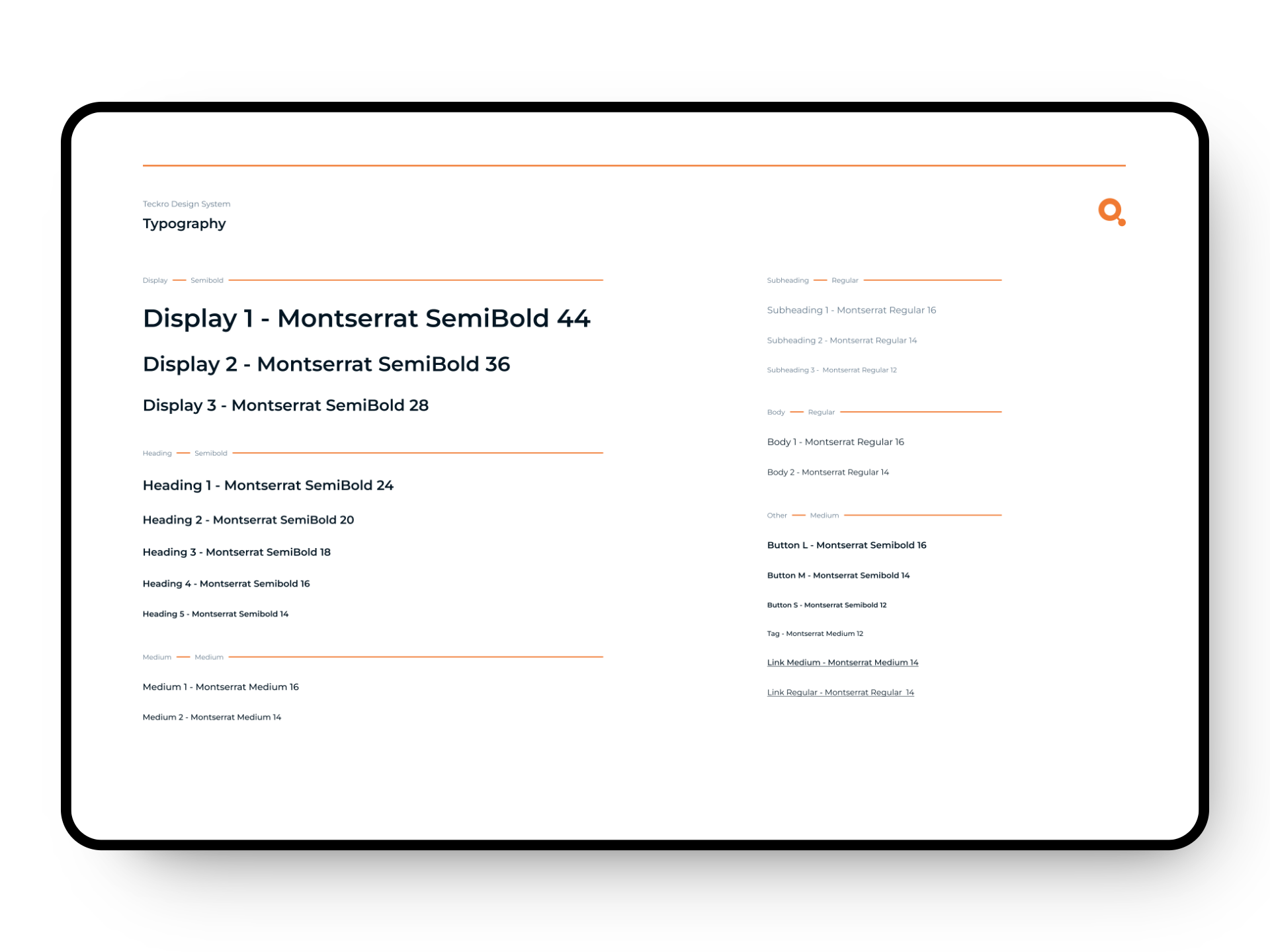
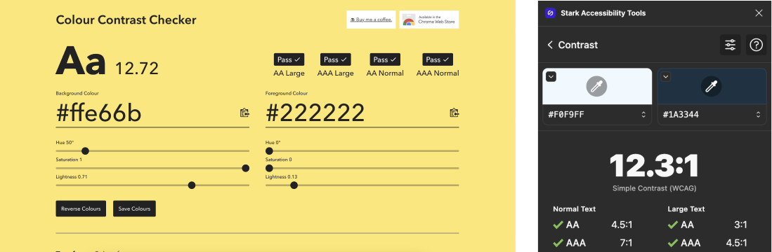
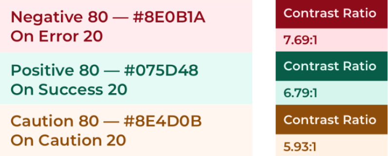
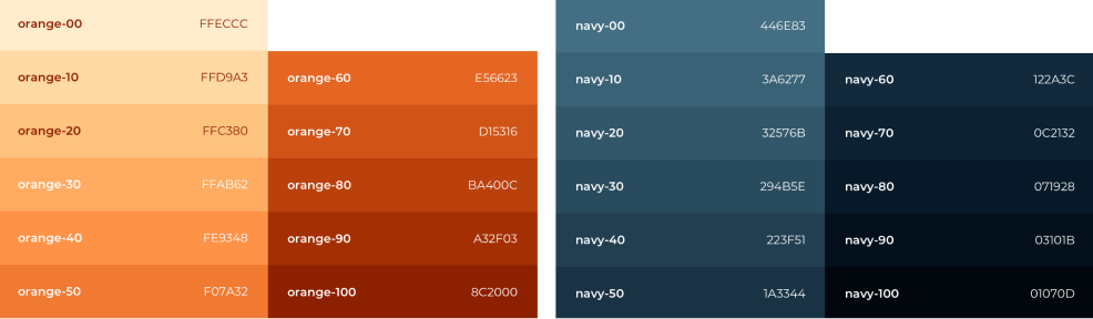
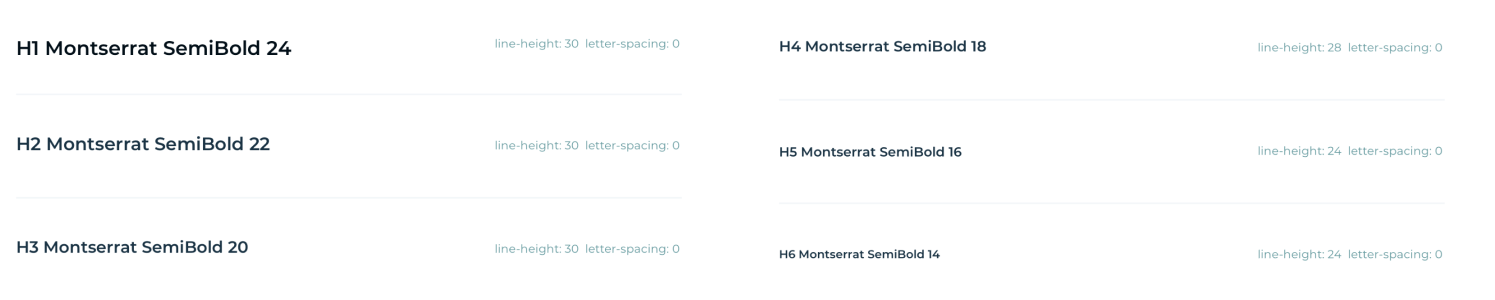
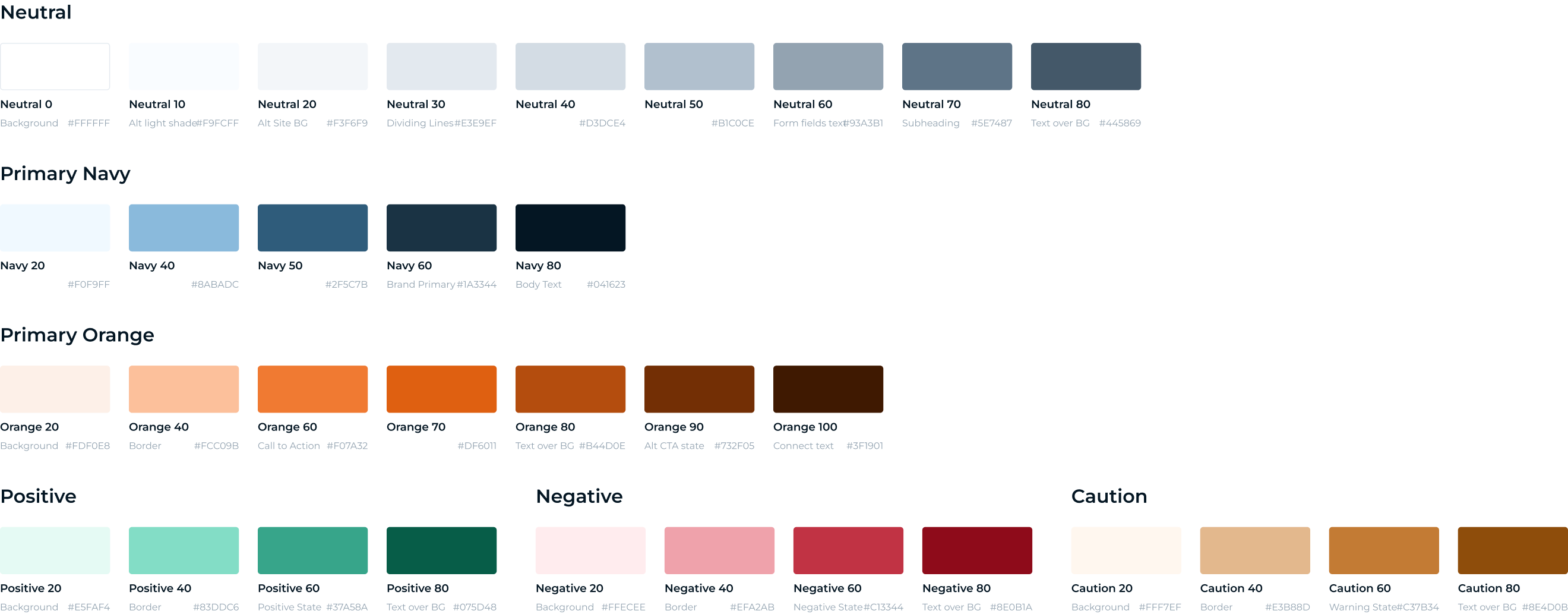
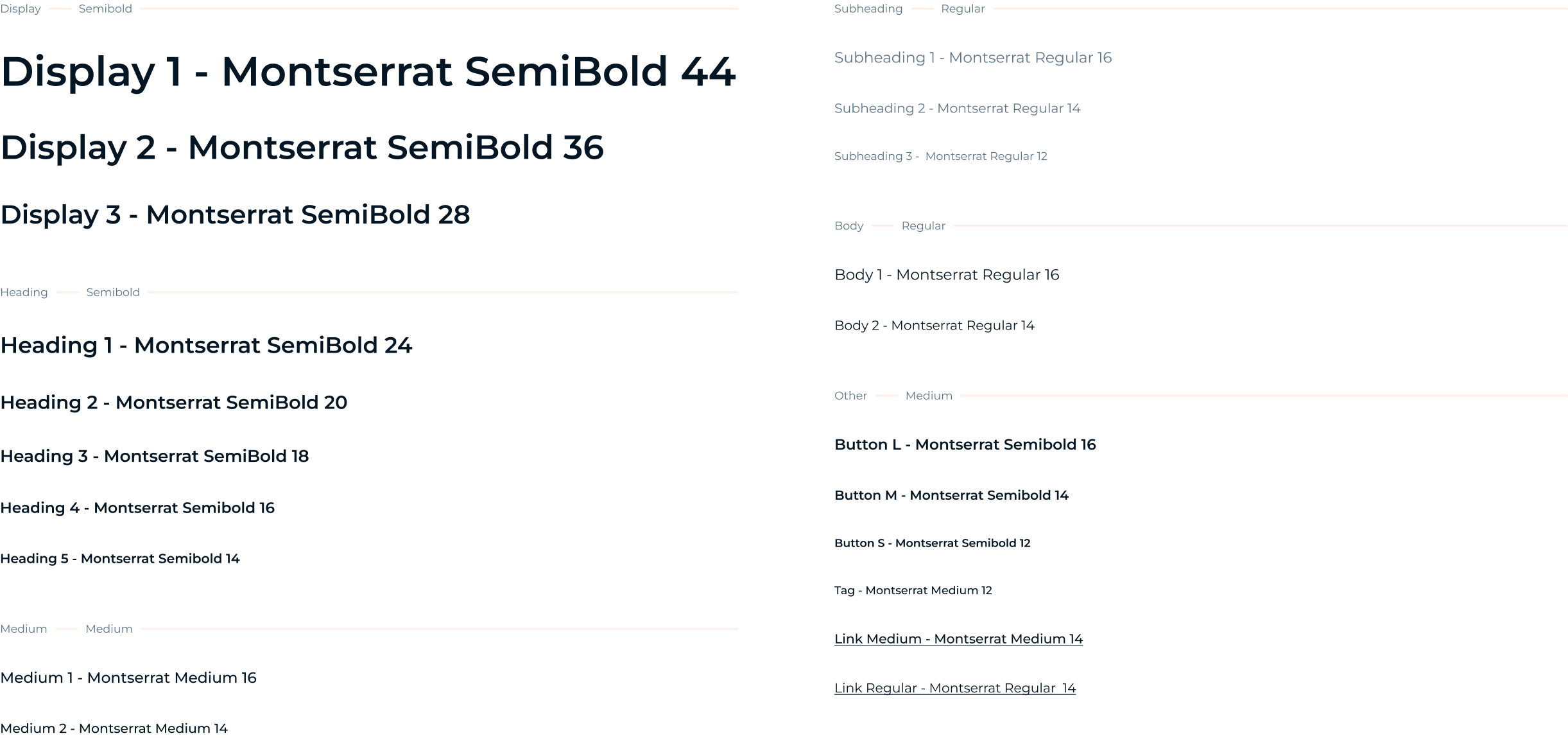
I took on the task of updating Teckro's design system by defining accessible type styles and colour palettes. Over the years, I've continued to develop and iterate on the design system.
Problem
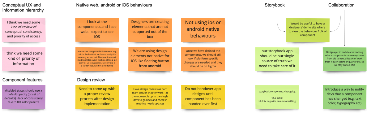
- Lack of clarity in colour and type usage led to inconsistency within the product.
- Time wasted on not reusing components as they weren't set up.
Responsibilities
- Ensured accessibility and maintained the design system.
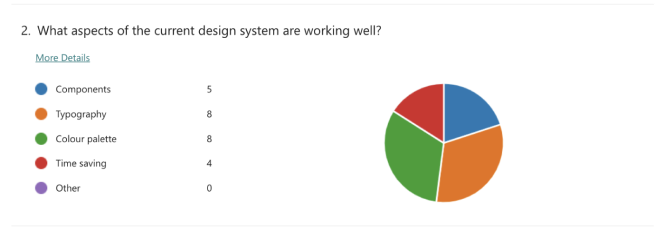
- Conducted research, workshops, and UI design.
Requirements
- Align with Teckro's brand identity.
- Promote visibility and community across the company.
- Document design guidelines, components, and patterns for different teams.
Project steps
1
Research
& discovery
2
Design
3
Project Conclusion
.png)