Project two
Teckro
(2021, 4 months)
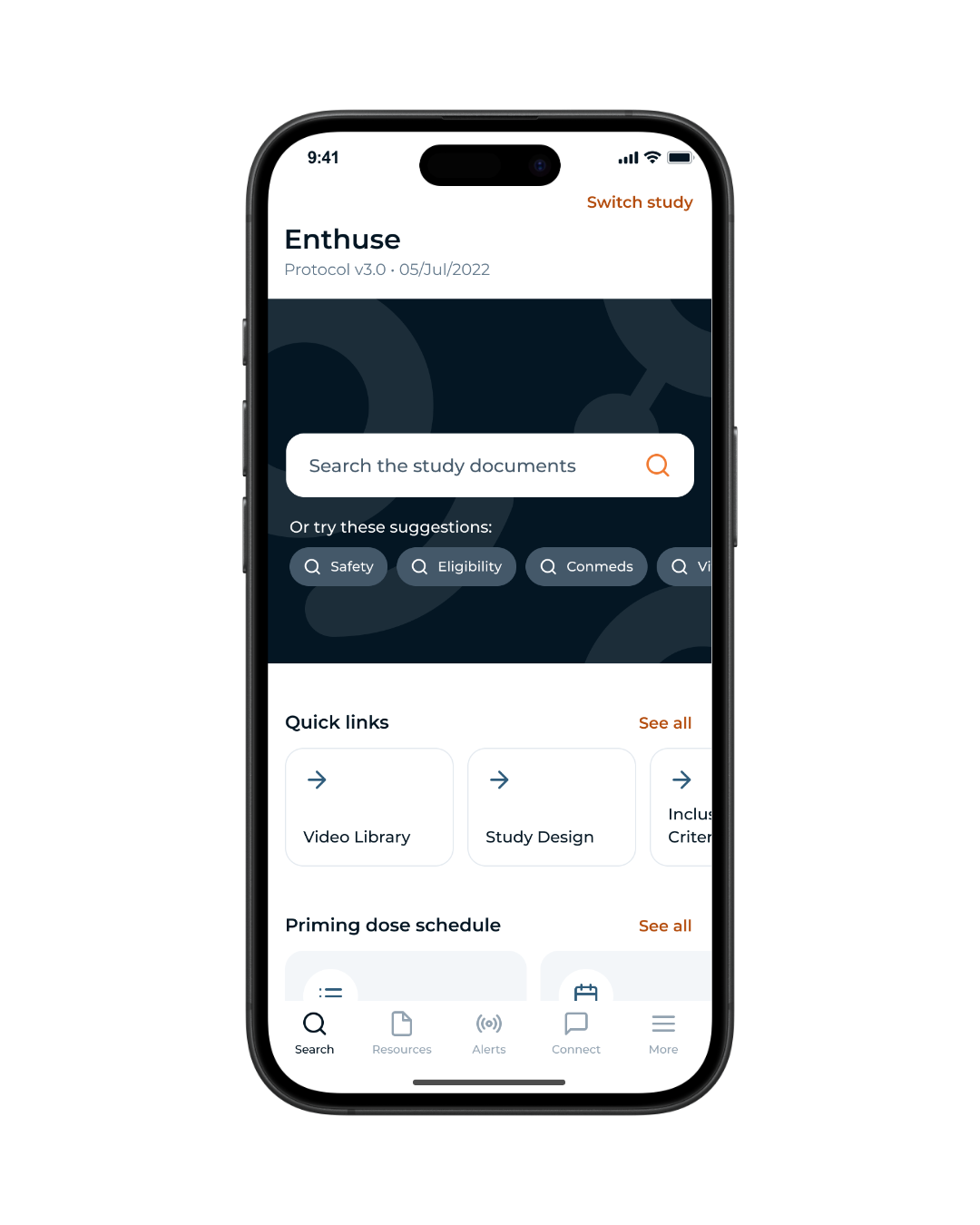
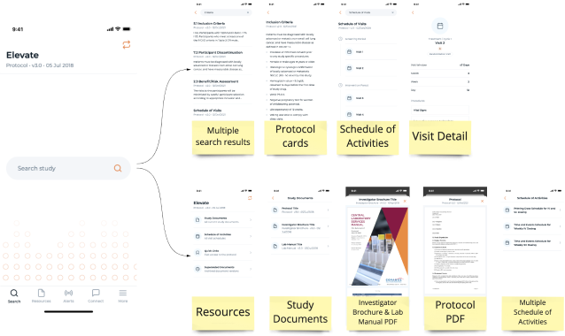
Search Homepage Redesign
Overview
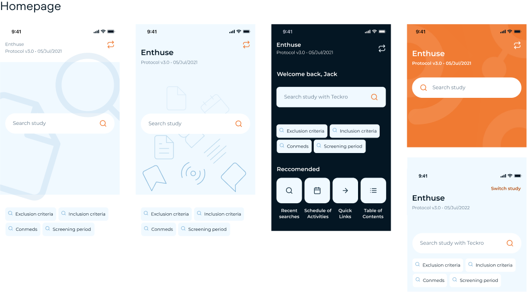
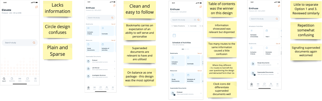
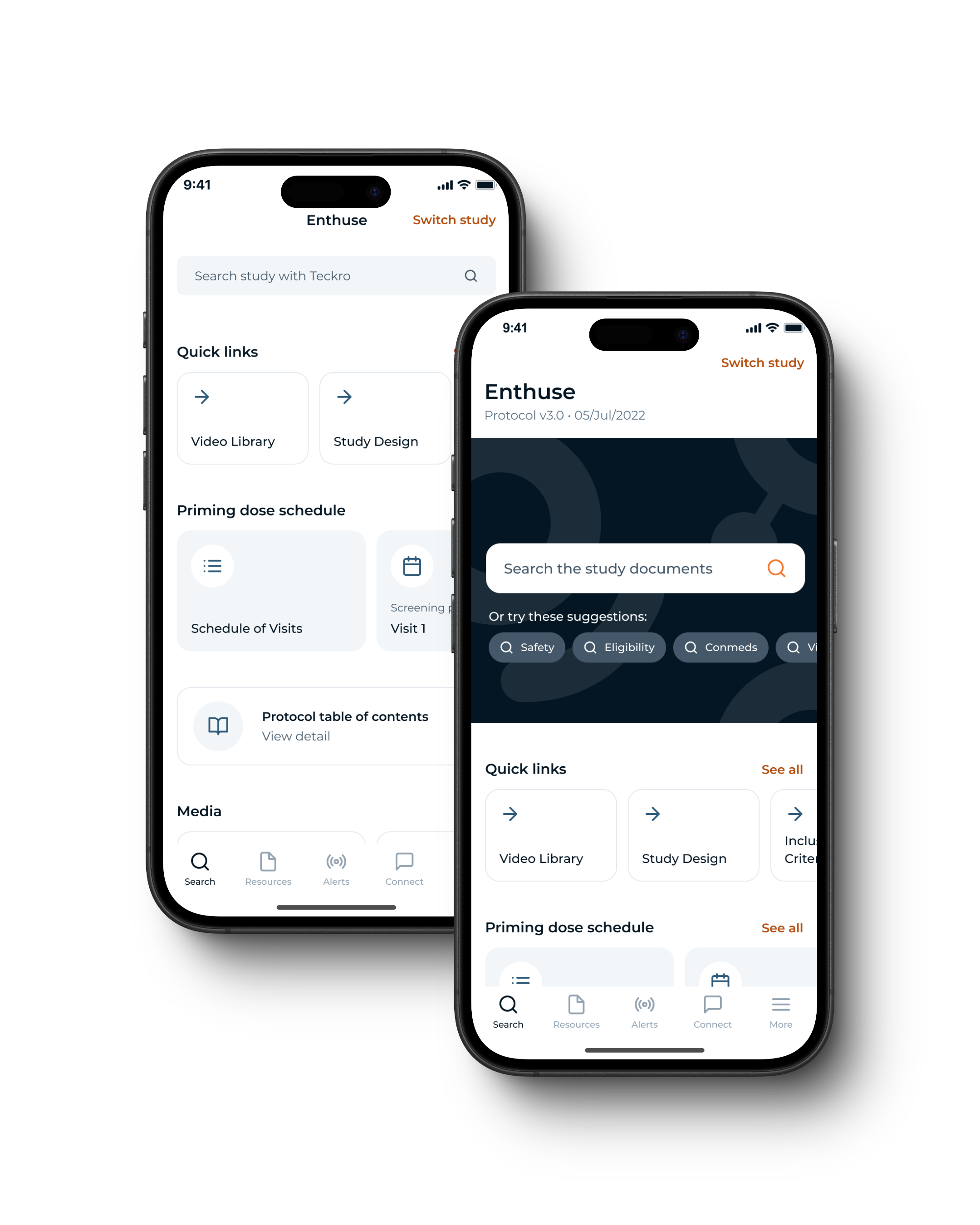
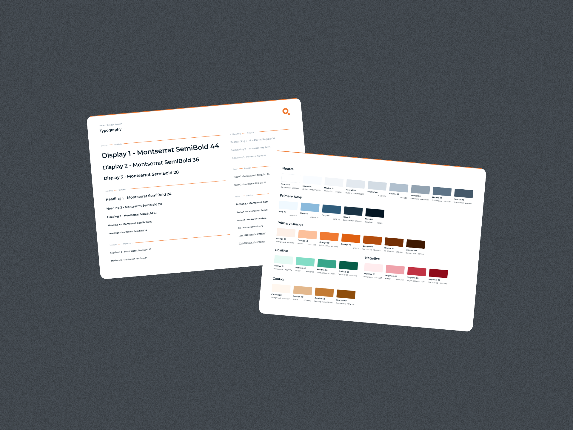
The Teckro homepage needed a redesign due to usability issues. Users found it uninviting and unclear, leading to confusion about the app's functionality. Our team embarked on a project to enhance the user experience and create a more engaging homepage.
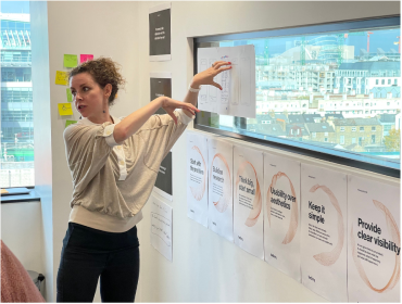
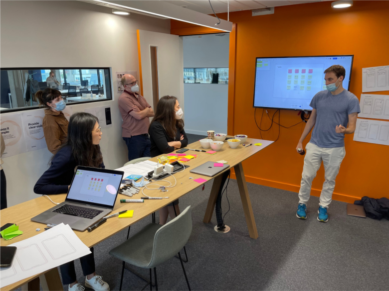
Responsibilities
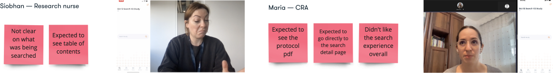
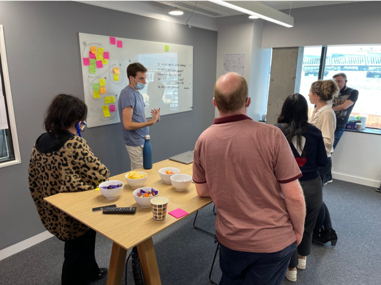
  • Conducted research and user testing.
  • Prepared and supported workshop sessions.
  • Worked on the UI design and ideation.
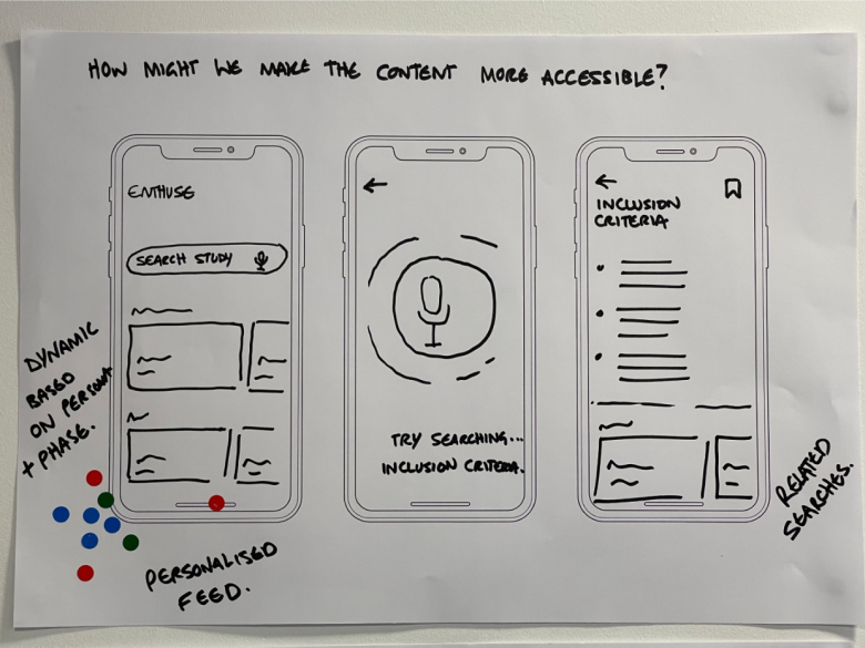
Requirements
  • Create a more engaging homepage.
  • Improve content accessibility.
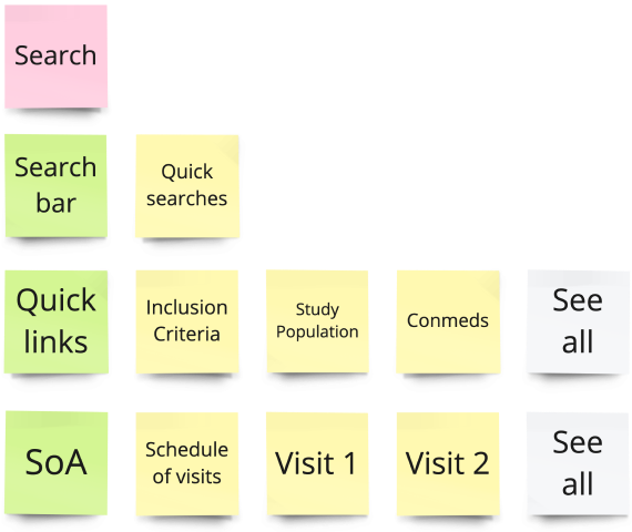
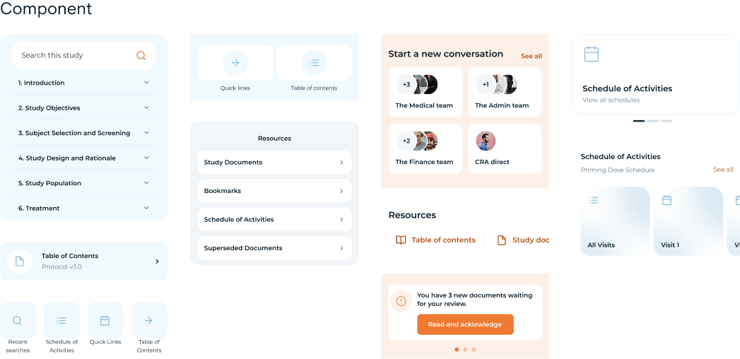
  • Expose available content types while emphasizing the search bar.
Project steps
1
Research & discovery
2
Define
& ideate
3
Design
4
Prototype
& test
5
Project 
conclusion
Key issues

Unclear actionability

The homepage was unactionable and lacked clear direction for users, leading to confusion and decreased engagement

Hidden features

Important features were buried within the app, making it difficult for users to discover what the platform offers

Low engagement

The single search bar approach failed to create an engaging or inviting experience, leading to low user interaction.

Research and discovery
1
Old Search homepage design
During this phase, we identified the need for a more intuitive navigation. We gathered user feedback, conducted contextual interviews, and collaborated across teams to collect valuable data and insights.
Early discovery
During our early investigations, we identified a significant issue: some of our top search results were features that users struggled to locate. To address this challenge, we fostered cross-functional collaboration across teams to gather extensive data inputs and user feedback.
Additionally, we conducted contextual interviews with users and stakeholders while carefully analysing customer feedback and support tickets.
Workshop
We worked collaboratively with PMs, developers, and QA to define the problem, create "how might we" statements, and prioritise issues.
Visual of the content hidden
Define & Ideate
2
We considered power users' needs and focused on creating clear workflows, content hierarchy, and wireframes to ensure a logical and accessible design.

Personas

While the homepage is designed to cater to all users, we focused on developing personas of power users to inform our decision-making process. This approach allowed us to gain a deeper understanding of the needs, goals, and behaviours of our core users. In future iterations, we plan to personalise the homepage based on user roles, creating a more tailored content hierarchy structure.

Wireframes

We created workflows to provide a clear and structured representation of tasks, steps, and processes related to the homepage. Our goal was to streamline the user experience by eliminating unnecessary steps and ensuring easy access to valuable content.

Content hierarchy

Maintaining a well-structured content hierarchy is crucial for organising information in a user-friendly manner. It played a vital role in prioritising content and guiding user behaviour. A logical flow is essential not only for user-friendliness but also for accessibility.

Design
3
We explored various design approaches, emphasising simplicity, usability, and high contrast. I enjoy the process of design iteration, exploring possible designs and their pairings. Our design aimed to highlight the search bar while making the entire app more inviting.
Prototype and test
4
User testing helped us refine the design, leading to a contrasting homepage feature that highlights the search bar and allows users to explore the app's other features.
Project conclusion
5
In the project's final stages, I implemented our brand colours and abstracted the icon from our logo to create a distinctive homepage feature. This feature highlights the search bar and smoothly collapses to allow users to explore the app's full range of offerings
Key learnings
  • I learned that simplicity, functionality, and clean design are the most effective attributes.
  • Involving the team early in the design process increased their engagement and enthusiasm. I now prioritise giving key team members a platform to voice their feedback.

  • When tackling large projects, I realised the importance of thinking iteratively. Prioritising the most impactful and feasible features proved to be a crucial factor in project success.
  • Collaborating across different functions greatly contributes to creating a holistic user experience.

Impact of the redesign

Positive user feedback

highlighted how the redesigned homepage was much more intuitive and easier to navigate, with many users expressing that they could find what they were looking for"within seconds" compared to the previous design

Internal stakeholder satisfaction

increased significantly after the release, with the majority praising how key features are now prominently displayed, aligning with business goals

Reduced customer support inquiries

regarding how to use the app’s main features, showing that the design changes made the interface more self-explanatory

UI UX projects
Design projects